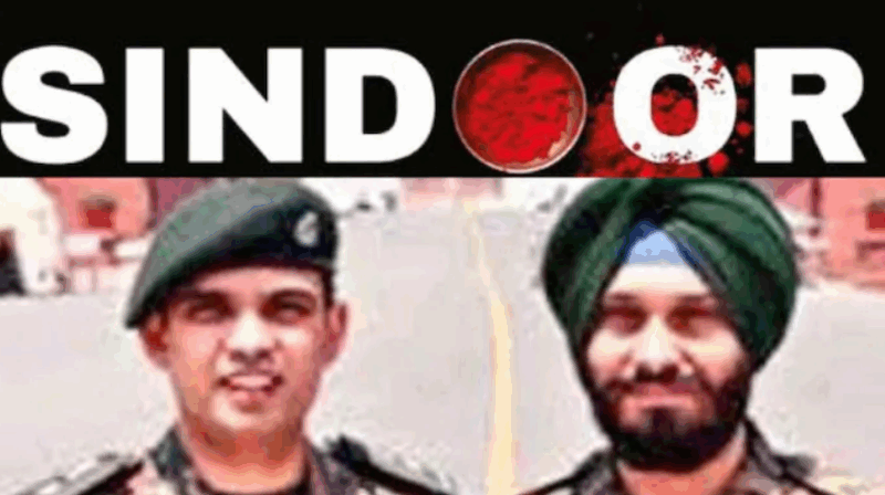
A simple yet powerful symbol has become the face of India’s decisive military response to terror. The iconic logo of Operation Sindoor, now etched in the national consciousness, was designed not by advertising professionals or branding firms, but by two men in uniform — Lt Col Harsh Gupta and Havildar Surinder Singh.
The logo, unveiled shortly after India’s precision strikes on May 7 against nine terror camps in Pakistan and Pakistan-Occupied-Kashmir, uses symbolism that has deeply resonated with millions. The second “O” in Sindoor is designed with a traditional vermilion bowl — a sacred symbol of married Hindu women — its bold red hue speaks volumes about sacrifice, justice and national pride.
According to the Indian Army’s special edition of Baatcheet magazine, this now-iconic image was created in-house by the Social Media Section of the Additional Directorate General of Strategic Communication.
“Operation Sindoor was not just a military mission, but the face of a changing India,” Prime Minister Narendra Modi said during his Mann Ki Baat radio address. “It reflects the country’s resolve, courage, and growing strength on the global stage.”
The logo was first posted at 1.51 am on X on May 7, just minutes after the conclusion of the 25-minute air operation. It was accompanied by a crisp, thunderous message: “#PahalgamTerrorAttack Justice is Served. Jai Hind!”
Justice is Served.
Jai Hind! pic.twitter.com/Aruatj6OfA
— ADG PI – INDIAN ARMY (@adgpi) May 6, 2025
The page-turning opening of Baatcheet carries the poster in full glory, underscored by the Indian Army emblem. The second page recounts the trigger — the April 22 Pahalgam massacre, where five terrorists slaughtered 26 civilians in the Baisaran Valley.
“This incident fortified the resolve of our country to fight terror with punitive action,” reads a caption titled Pahalgam.